
Thursday, 21 July 2011
LA13 Poster design using type
LA13 Poster design using type

With this design I used Eras Light ITC for the majority of the text, Castellar for the word gold, i thought it made it more prominent and almost golden. The brackets around the text are in Arial and i thought this gave it more unity but also caging in the word. Looking at it now I think there is a bit of tension between the comma after gold and the speech marks. But i'm pretty happy with it.
LA13 Poster design using type

For this type layout I used Bodoni all the way through. I didn't really know what to do with this one, so i made the shadow bigger than the rest and sat the other text on top. I gave the word shadow a shadow to add emphasis to it again. I'm not really sure with this one, but I couldn't think of anything else to do with it.
LA13 Poster design using type

For this type layout I used Impact for what I thought the main parts of the message, and then Bodoni for the rest of the quote. I decided to arrange the text so that it would all align into what looks like a rectangular shape. I left imagination and knowledge on their own line as they are the two most important words. I am pretty happy with this effort, I feel it looks interesting and not that hard to read.
Tuesday, 19 July 2011

LA9 Sketching Layouts

This is my business card layout.

Newsletter
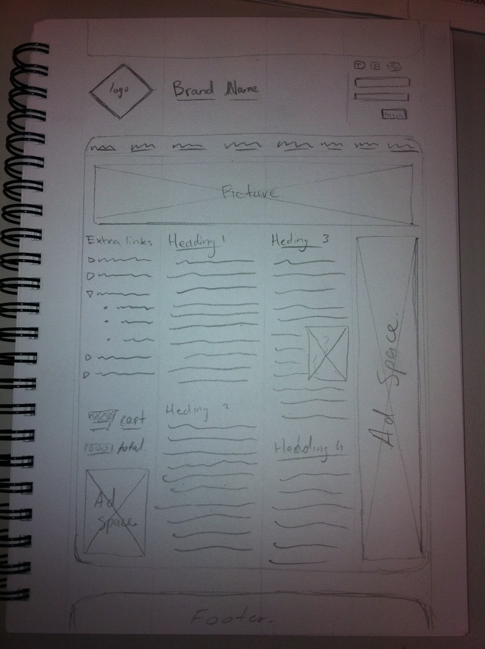
This is my website layout, im the happiest with this one out of the three.


Thursday, 14 July 2011


Wednesday, 13 July 2011

Tuesday, 5 July 2011


Subscribe to:
Comments (Atom)